![canibuild_white.png]](https://support.canibuild.com/hs-fs/hubfs/canibuild_white.png?height=40&name=canibuild_white.png)
DocStudio is a document designer built into SiteCheck that lets builder admins lay out their own Flyers, Proposals, Quotes, Compliance Reports and Site Plans, then publish them for the whole business to use.
Templates are built on a true-to-print canvas, measured in real paper sizes & dimensions, with live deal data placed wherever a real value belongs. Because the same drawing engine renders the editor, the preview & the final PDF, the document a rep generates from a deal always matches what was designed.
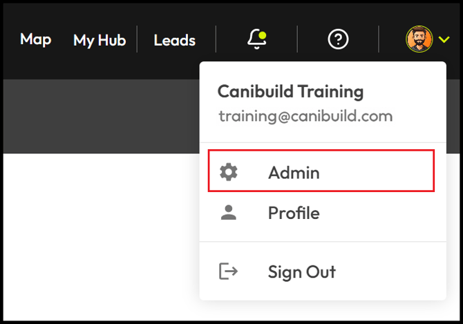
- To access the Admin section Click on your initials on the top right corner of the screen.
- Select Admin from the dropdown menu.
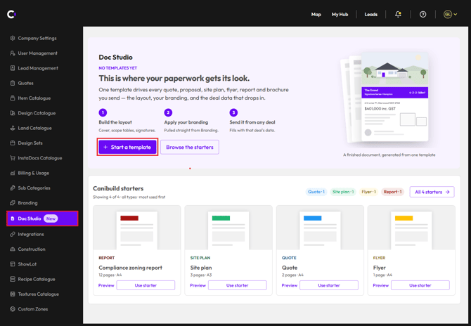
- Select Doc Studio.
- Select + Start a template.
OR
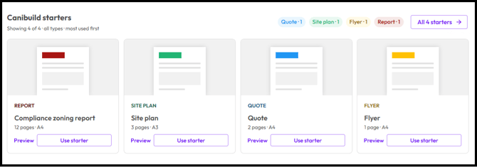
Rather than building from a blank page, admins open Doc Studio and duplicate one of the Canibuild starters with Use starter, then customise it. Four starters are available today: Site plan (3 pages, A3), Quote (2 pages, A4) and Flyer (1 page, A4). Each starter also has a Preview option, and an account with no templates yet can begin from Start a template or Browse the starters.
- Select Compliance Zoning Report - Enhance & customise the existing report.
- Select Siteplan – rebuilt page for page from the site plan generated today.
- Select Quote – a quote layout ready to duplicate and brand.
- Select Flyer – a flyer layout ready to duplicate and brand.
If someone in your team has already created a document then you home screen will change to show all active templates. This will now also give you access to the Importer function.
- Click the 3 dots to edit an existing template.
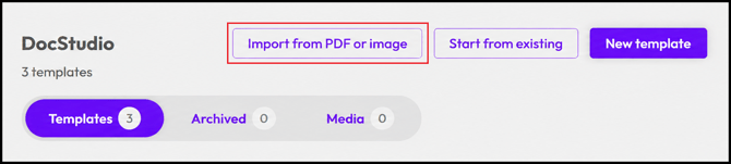
- Click Import from PDF or Image to upload a premade document.
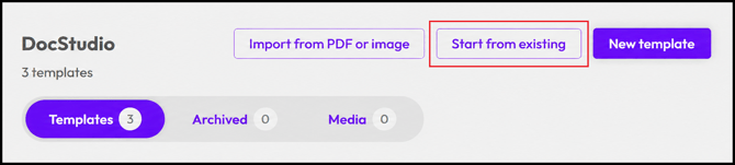
- Click Start from existing to make a copy of an already created template.
- Click New template to open a blank document.
To understand all of the features review the recording or jump to New template.
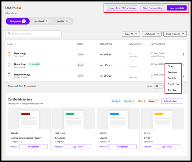
Click to edit an existing template
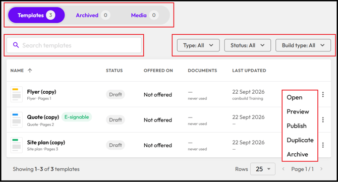
- Click Template, Archived or Media to cycle though each folder
- Enter a name into the Search templates bar.
- Click Type, Status or Build type to filter template list.
- Click the 3 dots to Open, Preview, Publish, Duplicate or Archive a template
Open - Loads the template for editing.
Preview - Opens a sample published version of the template.
Publish / UnPublish - Pushes the document live to the Generate tab in app.
Duplicate - Makes a copy of the template for editing.
Archive - Sends the document to the Archives folder.
Templates can only be Deleted from the Archive folder
Click Import from PDF or Image
If you have created any existing document wheather its just one page or a full detailed proposal it can be uploaded into the Importer. This will scan the document and apply various tokens to the existing elements on each page making it easier for you to edit.
- Click Import from PDF or image.
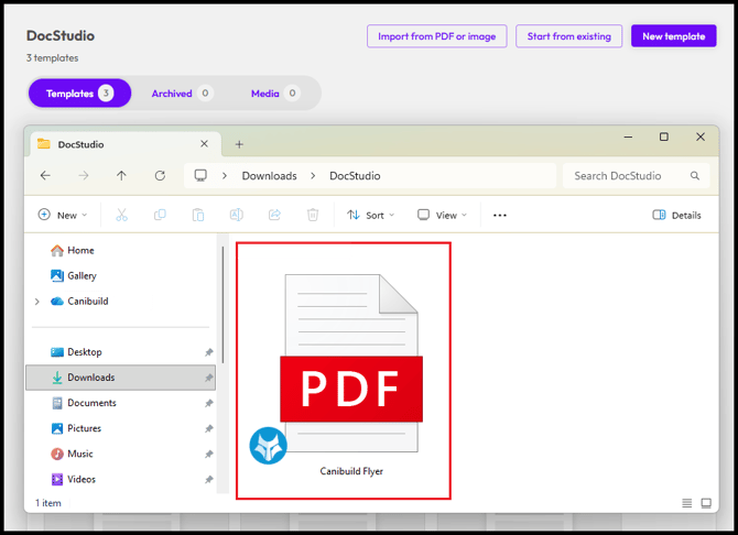
- Select a document to upload.
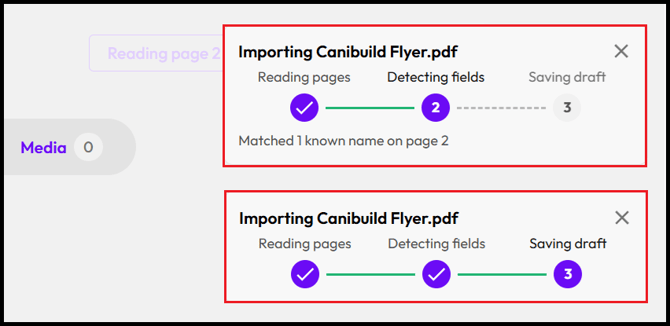
- Wait for the document to load.
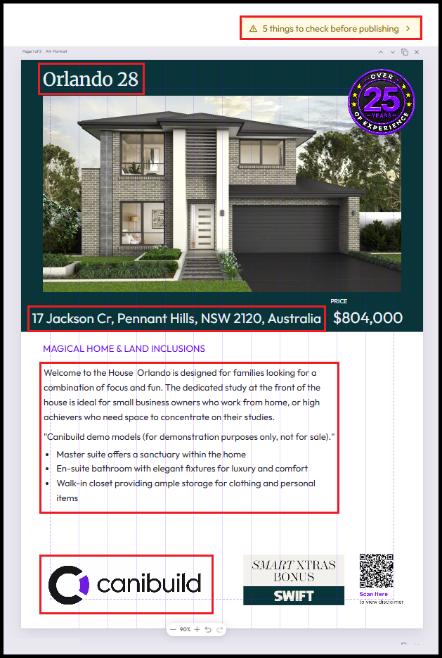
The Importer has analysed the document based on the layout & specific data points. It will then allocate specific tokens (reference points) to pull in the correct site information form the app. Some key examples are:
- Cover image
- Floor Plan
- Sales Persons (Name / Email / Phone)
- Clients Name
- Build Address
- Review the check items at the top of the page.
- Edit & add elements to each page as necessary.
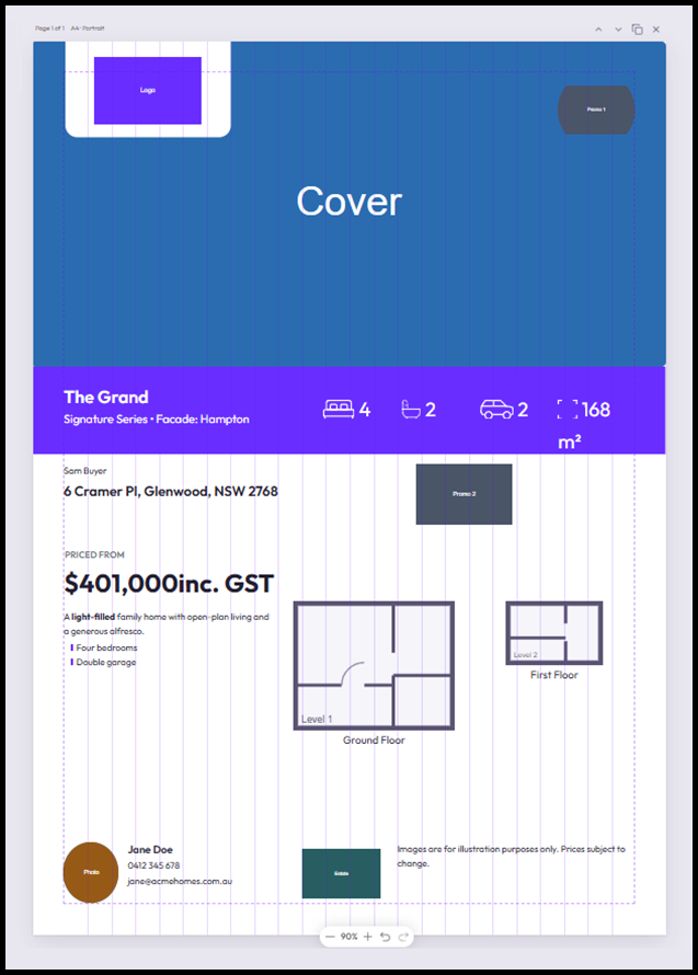
Review Create New Template below to understand the different tokens & Elements that can be added. Note how key details about the design are being pulled through as tokens.
Click Start from existing
Once you select an existing template it will make a copy of your selection allowing you to create a variation of the selected document. Useful if you are creating an almost identical document with just a few variations such as specific inclusions or branding logos or colours.
-
Click Start from existing.
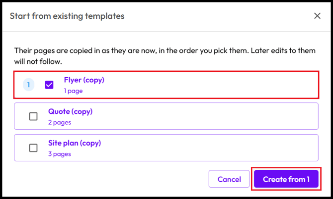
- Select a template from the list.
- Click Create from.
The selected document will open exactly as it was. Review Create New Template below to understand the different tokens & Elements that can be added.
- Edit & add elements to each page as necessary.
Click New template
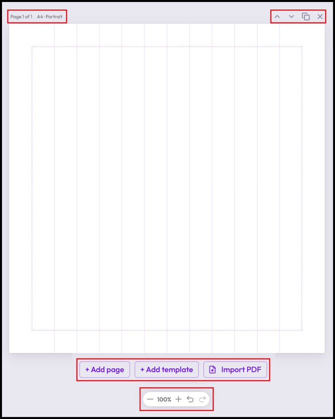
The blank document allows the flexibility & customisation of each page with a variety of different elements. Each page will be numbered & highlight the page size & orientation.
- Click the up / down arrows to move the page up & down.
- Click the double square to duplicate the page.
- Click the X to delete a page.
- Click + Add Page to add an additional blank page.
- Click + Add template to pull an existing template into the current document.
- Click Import PDF to add static pages from an existing document.
- Click the +/- to adjust the page zoom.
- Click the back arrow to undo a step.
- Click the forward arrow to redo a step.
-
Live deal data – 114 fields across company, design, attributes, pool, salesperson, contact, site, site plan, land, package, inclusions, quote and document information. Authors preview a template against any real deal in the business, and a missing value never prints as a stray zero or an empty label.
- Rules and targeting – show or hide any element or page based on data conditions (is set, equals, greater than), build type, group or team, or number of storeys, so one template can cover cases that previously needed several.
- Widgets – 15 ready-made blocks including salesperson, attributes strip, floor plans at true relative scale, gallery, inclusions, site plan captures with a true scale rule, site calculations, title block, annotations, signature and a data table, plus 7 compliance blocks (status, rules table, pathway, overlays, facts, contours, references). Any group of elements can be saved as a reusable widget for the business.
- Quote elements – Items, Payment Schedule, Optional Items, Totals, Description and Initials pull from the deal's real quote and flow across as many pages as needed. A Prepare step at send time captures the deposit, payment schedule and job site. The quote's own arithmetic is always used, never the template's.
- Signing – each user captures a signature once and it is applied to every document they generate. An e-signature block can also send a document out for signing through DocuSeal.
- Print and regional settings – six paper sizes (A5, A4, A3, US Letter, Legal, Tabloid), headers and footers, margins and grid, and eight embedded fonts. Templates support AUD/USD/NZD/CAD currencies, imperial units for US accounts, local date formats, and "ADUs" in place of "Granny Flats" for US and Canadian accounts. Existing PDFs can also be imported as pages.
- Click All templates to return to the home menu.
- Click Untitled template to edit the document name.
- Click the Back / Forward arrow to undo or redo a step.

Document
Click the link below to find the section of the article:
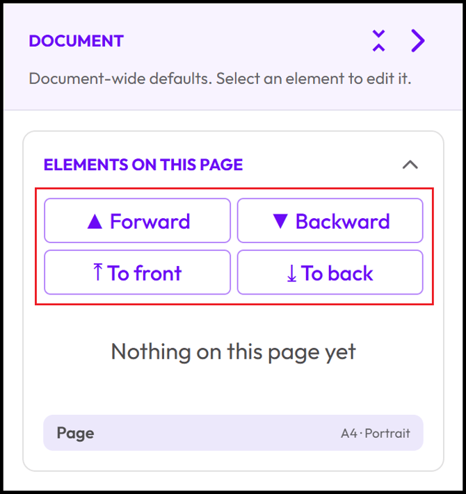
Document settings on the right of the screen allow the setup of each page & overall management of all elements.
ELEMENTS ON THIS PAGE
- Click Forward / Backward to move an element by one layer level.
- Click To front to move an element to the top layer.
- Click To back to move an element to the bottom layer.
PAGE SETTINGS
Each page of the document can be adjust in a different way as necessary.
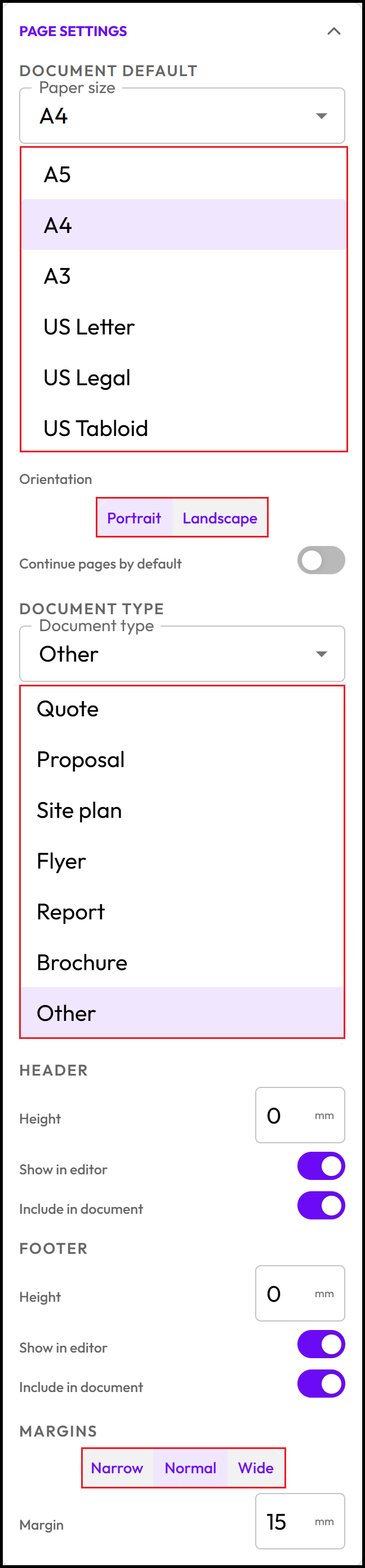
- Select Paper Size (A5 / A4 / A3 / US Letter / US Legal / US Tabloid).
- Select Orientation (Portrait / Landscape).
- Select Continue pages by default to keep the page formatting consistent.
- Select Document type (Quote / Proposal / Site plan / Flyer / Report / Brochure / Other)
- Set Header height & adjust if to be shown or included in the document.
- Set Footer height & adjust if to be shown or included in the document.
- Set Margins (Narrow / Normal / Wide).
VISIBILITY
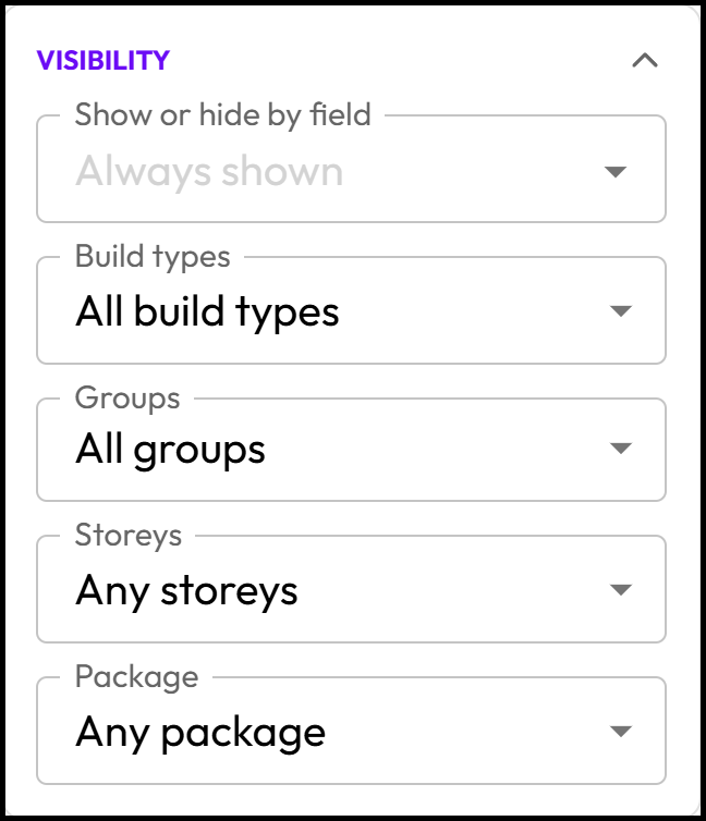
Visibility can also be set at the publishing level. It allows the document to adhere to specific criteria.
- Select Show or hide by field.
- Select Build types to lock the document to one or more of your build types.
- Select Groups to allocate the document to a specific team (Groups must be first created under User Management)
- Select Storeys (1 Storey / 2 Storeys / 3 Storeys)
- Select Package (Standalone / House & Land) - Select Standalone unless a house builder.
EDITOR SETTINGS
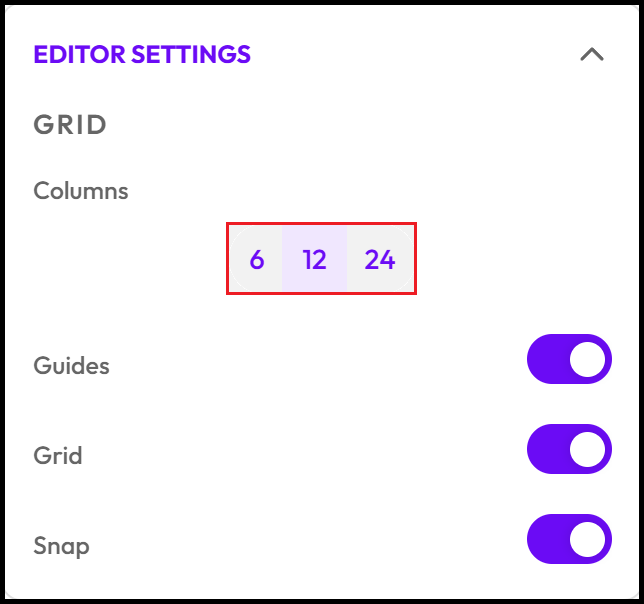
- Select Column number to add Gridlines.
- Toggle Guides to turn boarder margins on/off.
- Toggle Grid to turn gridlines on/off.
- Toggle Snap to assist with squaring up elements on the page.
TYPOGRAPHY
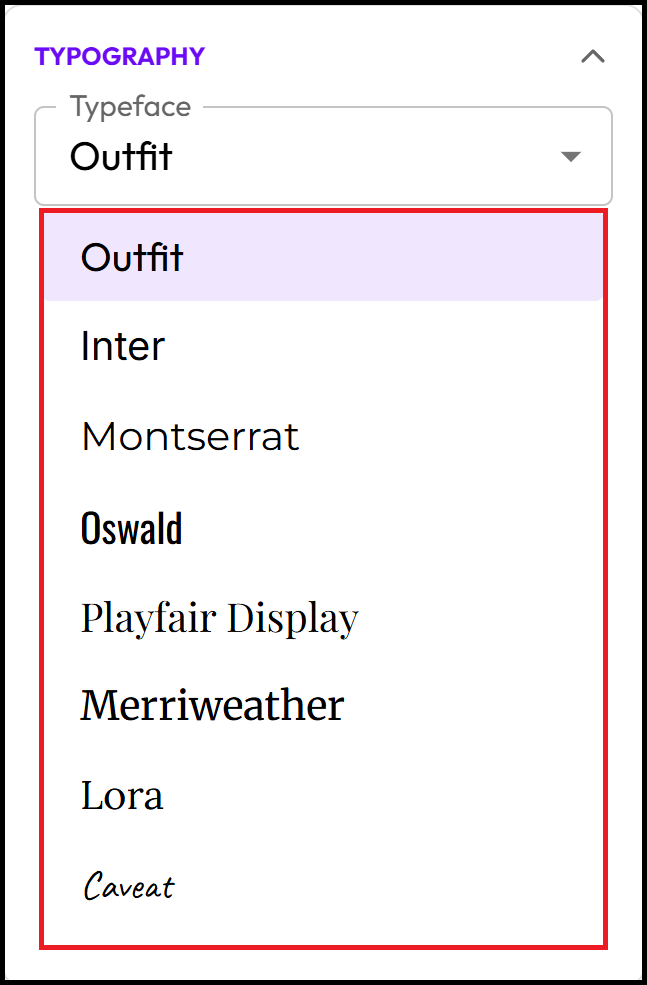
Select from one of the 8 Typefaces available on the list. Other text can be added as images if specific fonts are required for key elements. Tokens can only be one of the 8 fonts listed below.
- Select Typeface for each of the text elements added to the screen.
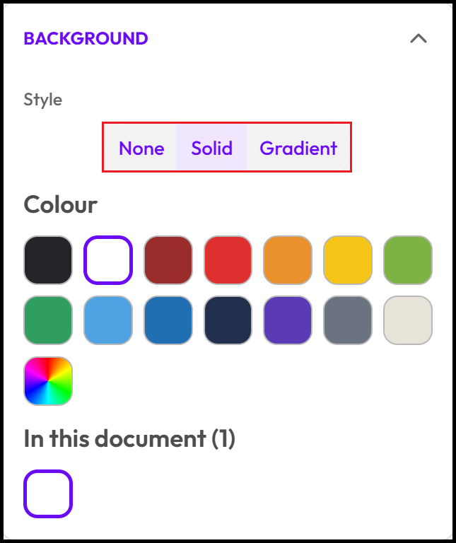
BACKGROUND
Choose from one of the preset colours or select the colour pallet to enter *RGB or Hex codes for a specific colour. Gradient will allow you to select multiple colours and apply a colour transition to the page.
- Select Background Style (None / Solid / Gradient)
Add Elements
Different elements can be dragged onto the screen to build out each document. The Search bar can be used to easily find a specific element that is needed.
Click the link below to find the section of the article:
TEXT
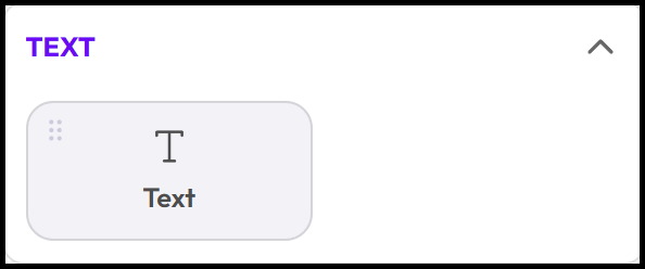
The Text element is what you'll use most in your template, for anything from headings to body copy to captions. Each text box carries its own role and style, so you can set a consistent look once (e.g. a heading style vs. body copy) and reuse it across your template. Text elements can also hold tokens, so a text box can mix your own written copy with data pulled straight from the deal, like combining "Prepared for " with the client's name token in a single line.
- Click & Hold Text & Drag it onto the page.
MEDIA
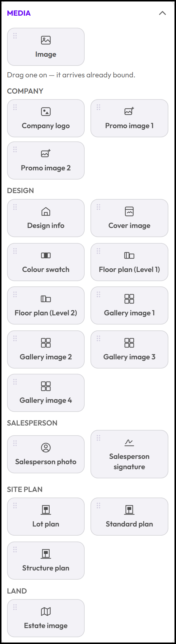
Media gives you two options you can add an image that will allow you to add any image to the page that you have stored on your computer it will upload at a 1:1 scale. It can then be resized & positioned. The other options are Token Images these are all images that are already stored within your account. Some key examples are your floorplan or facade/elevation images.
- Click & Hold Image & Drag it onto the page.
- Click & Hold Token Image & Drag it onto the page.
Token images are grouped into specific categories that will make it easy to search for & identify what you are looking for. Depending on the document you are creating you may need specific images. These Include:
- Company.
- Design.
- Salesperson.
- Site Plan.
- Land.
SHAPES
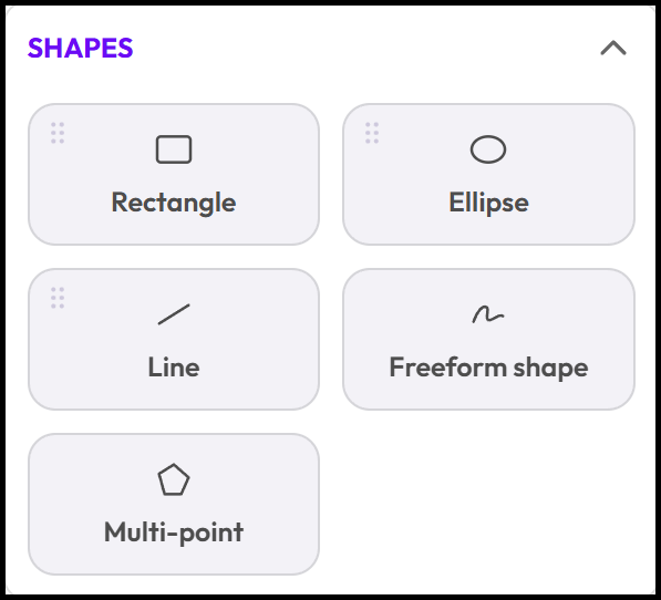
The Shapes panel lets you add basic drawing elements to your template alongside your bound content. Rectangle and Ellipse are click-and-drag shapes you can use as backgrounds, dividers, or containers. Line draws a straight line between two points, while Freeform shape and Multi-point shape let you draw custom, irregular outlines by clicking to place each point on the page. Unlike widgets and tokens, shapes aren't bound to deal data, they're purely visual elements for styling and structuring your layout.
- Click & Hold Rectangle & Drag it onto the page.
- Click & Hold Ellipse & Drag it onto the page.
- Click & Hold Image & Drag it onto the page.
- Click Freeform shape to activate, click & draw on the page.
- Click Multi-point shape to activate, click & draw on the page.
LAYOUT
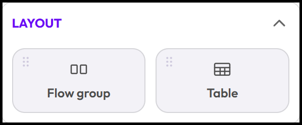
Depending on what is to be included in your document you may need to add specific elements for layout. A flow group lets you group elements (like icons and labels) so if one has no data, it disappears and the others slide over, keeping your layout clean instead of leaving a gap. An example could be a garage icon for design attributes. The table option lets you build out your data in a grid format so it displays clean.
- Click & Hold Flow group & Drag it onto the page.
- Click & Hold Table & Drag it onto the page.
QUOTE
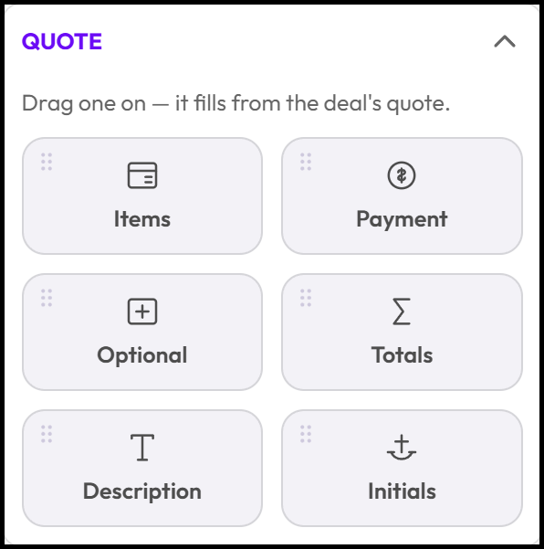
The Quote section allows you to build out a custom quote layout. You can use the prebuilt template as a starting point or build your own. The items option does come with the totals. If things need to be spaced out then the sum option can be added. E-Signatures can be added & initials as well as design descriptions.
- Click & Hold Items & Drag it onto the page.
- Click & Hold Payment & Drag it onto the page.
- Click & Hold Optional & Drag it onto the page.
- Click & Hold Totals & Drag it onto the page.
- Click & Hold Description & Drag it onto the page.
- Click & Hold Initials & Drag it onto the page.
Here is what each of the Quote Widgets do:
- Items — Drops the quote's line-item table onto the document, pulled straight from the deal's quote.
- Payment — Drops the payment-schedule table, built from the tenant's configured payment schedule (deposit/balance split, amounts). If the payment schedule toggle is off when the quote is generated, this widget prints nothing and takes up no space, rather than leaving a blank table.
- Optional — Drops the optional-items table — extras or upgrades on the quote that aren't part of the base price.
- Totals — Drops the price summary: subtotal, deposit line, and balance, computed server-side from either the tenant payment schedule or a manually entered deposit.
- Description — A text block pre-bound to, the free-text note entered in the Prepare Quote modal when generating. Renders nothing if left empty.
- Initials — Places a DocuSeal signing anchor (client, secondary client, or builder) sized for a footer, so each party can initial the quote. It only appears in the output if "Request initials" was switched on when the document was generated; otherwise it renders nothing.
COMPLIANCE
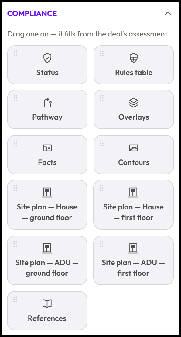
The Compliance widgets pull directly from the deal's zoning and compliance assessment, so each one fills in automatically once you drag it onto the document. Status shows the overall compliance verdict, while Rules table and Pathway break down the specific rules and assessment pathway applied to the site. Overlays lists any zoning layers affecting the property, and Facts and Contours capture the parcel's key details and lot contours. The Site plan widgets (House or ADU, ground floor or first floor) drop in the matching floor's site plan automatically, and References lists the sources behind the assessment.
- Click & Hold a Compliance Widget & Drag it onto the page.
Here is what each of the Compliance Widgets do:
- Status — The overall compliance verdict element for the assessment (e.g. Compliant / Conditional / Action Required), pulled straight from the deal's assessment result.
- Rules table — Lists the pathway and rule-group bands with pass/fail status badges for each rule checked. Flows across multiple pages automatically if the rule list is long.
- Pathway — Shows which assessment pathway(s) applied to this site and whether each one applies, based on the deal's assessment.
- Overlays — Lists the zoning/planning overlay layers affecting the property (e.g. flood, bushfire, heritage), shown as a table or as cards.
- Facts — A summary of parcel and site information (e.g. lot size, dimensions, zoning), shown as rows or tiles.
- Contours — Captures the parcel's lot and contour lines from the site plan data.
- Site plan — House — ground floor — Drops in the ground-floor site plan for a house design, only printing when that build type/floor applies.
- Site plan — House — first floor — Same as above, for the house's first floor.
- Site plan — ADU — ground floor — The ground-floor site plan for an ADU/granny flat design.
- Site plan — ADU — first floor — The first-floor site plan for an ADU/granny flat design.
- References — Lists the sources and references behind the assessment findings, grouped by section, with links back to the original data.
Note: the four Site plan widgets are conditional — each only appears in the generated document when that specific build type and floor combination is relevant to the deal; otherwise it renders nothing rather than leaving a blank page.
SIGNING
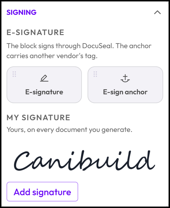
The Signature options let you collect a signature directly on your document. The E-signature widget adds a signing block that the client completes digitally through DocuSeal, right within the document itself, so there's no separate signing step outside the flow. If you use a different e-signing provider, the E-sign anchor widget lets you place an invisible marker in the document telling that provider's system exactly where to add its signing field. For a printed copy instead, the Signature line widget adds a blank line with the client's name underneath for a physical, handwritten signature.
- Click & Hold E-Signature & Drag it onto the page.
- Click & Hold E-Sign anchor & Drag it onto the page.
- Click Add Signature to add a company owner signature to co sign documents.
WIDGETS
A Widget is a reusable, pre-built group of elements (like a flow group with its icons and labels) that you save once and drop into any template, so you don't have to rebuild the same layout from scratch each time. Canibuild provides a list of Widgets as a starting point with the ability to create custom ones as well. Some good ones to use are Sales person or floor plan.
- Click & Hold a Widget & Drag it onto the page.
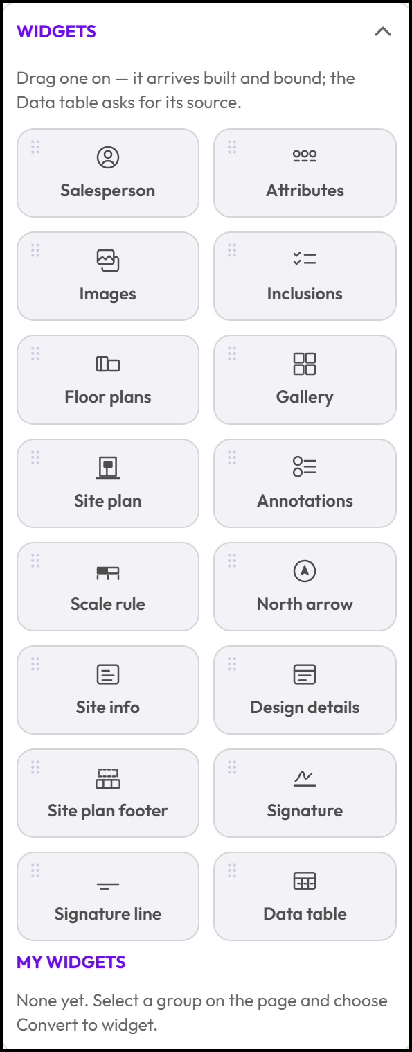
Here is how to save time with the Canibuild Widgets:
- Salesperson — Drops the salesperson's photo (or initials if none uploaded), name, and contact details onto the page, bound to the deal's salesperson.
- Attributes — Icon + value pairs like beds, baths, garage spaces and area. Each pair disappears together if that value doesn't exist, so you never get an icon next to a blank.
- Images — Places every image linked to the design (cover shot, floor placements, gallery) in one drop, with each slot still individually editable or removable afterward.
- Inclusions — A bound list of a design's inclusion names.
- Floor plans — Set-and-forget: stacks a multi-storey design's floor plans at true relative scale to each other automatically.
- Gallery — Every image in a design's gallery, laid out in a grid that adjusts automatically to how many images there are (up to 12).
- Site plan — The map capture of the lot/site, drawn to a true scale for the paper size, with the north arrow.
- Annotations — The deal's site notes as numbered cards (author, date, comment, photos), continuing onto extra pages if there are more than fit.
- Scale rule — The scale ratio and matching visual scale bar for the site plan capture.
- North arrow — A compass marker you can drop anywhere and resize; it rotates to match the actual map bearing of the site.
- Site info — A card of site calculations (like floor space ratio and site coverage), where each row only shows if it has a value.
- Design details — A card of the placed design's own specs (e.g. bedrooms/bathrooms for a house, volume/depth for a pool) — automatically shows only the fields relevant to that build type.
- Site plan footer — The full title block: client/contact details, property details, sheet info, version, and generated-by details, all driven by your branding settings.
- Signature — The salesperson's saved signature image plus the date and client name.
- Signature line — A blank line with the client's name underneath, for the client to sign on a printed copy (no digital capture).
- Data table — A configurable table (rows/columns/borders/headers) for anything tabular — specs, inclusions by room, pricing summaries — with each cell able to hold a bound token.
TOKENS
A Token is a placeholder you drop into a text element (like a client's name, site address, or design price) that automatically pulls in the real value from the deal when the document is generated, instead of you typing it in by hand.
- Click & Hold a Token & Drag it onto the page.
- Edit the text formatting for each Token.

If you do thing of a possible Token that should be on the list but is not. Please reach out to our support team so it can be added.
Publishing & Managing the LifeCycle
Make sure the document has been name appropriately so that your team can easily identify it for its created purpose.
From DocStudio, admins can publish a template into an existing document slot or as a new entry in the Generate menu, unpublish it, revert to the previously published version, and archive or restore templates. A Media tab shows every location where an uploaded logo or image is currently used.
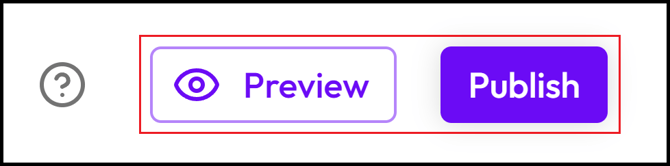
- Click Preview to make sure the document is displaying correctly.
- Click Publish to push the document live to Canibuild.
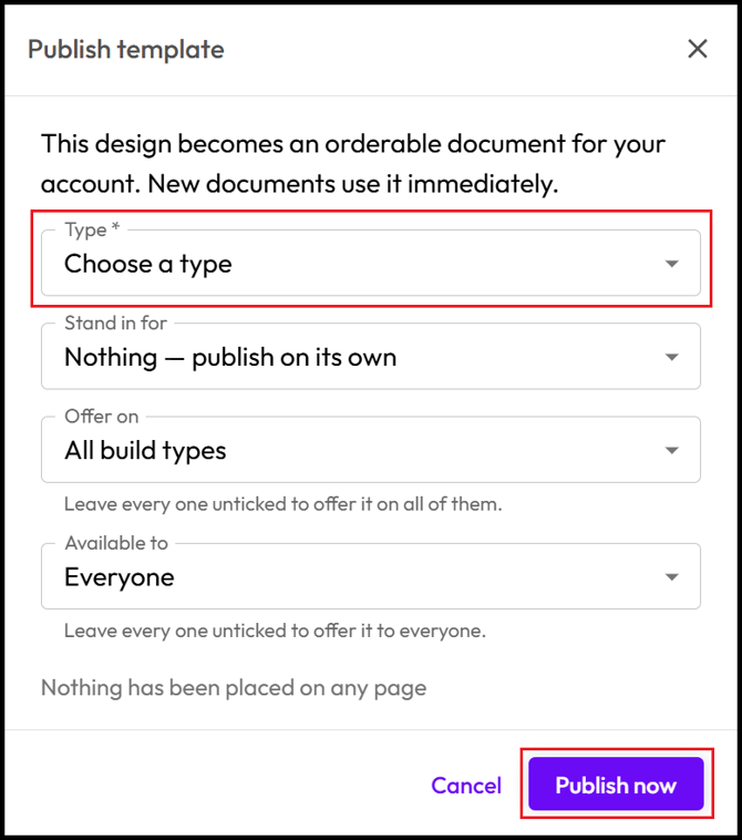
The minimum information to publish is to select the document Type.
Publishing a template into a document slot, such as Site Plan, replaces the built-in default document for that slot, since only one document can occupy a slot at a time.
-
Select Type (Quote / Proposal / Site plan / Flyer / Report / Brochure).
- Only Select Stand in for if you want to replace the existing Canibuild document.
- Select Offer on to lock a document to a specific Build Type.
- Only Select Available to if you need to allocate the document exclusively to a specific group.
- Click Cancel if you need to still edit the document.
- Click Publish now to go live.
Available to will only work if alternate groups have been created in User Management.
To Generate a document return to any property address & place a design if not done already.
- Click Generate.
- Select Document.
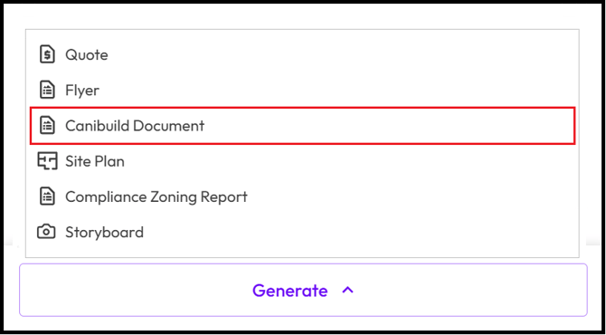
- Wait for the Document to Generate & Download
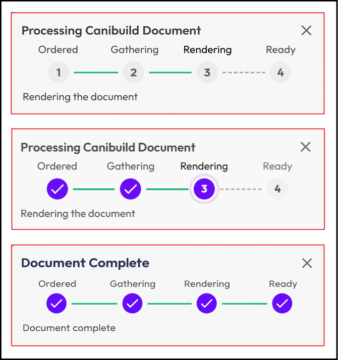
All documents will be stored under CRM & the Orders tab in MyHub for re access when necessary.